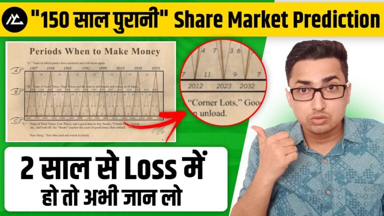
If you are bearing losses in the stock market for the past two years, you are following a century-old prophecy.
What? A prophecy about your loss? Yes, and that prophecy is incumbent into a 150 year old chart that predicts the scenario of the stock market in the future, intriguingly, it predicts the scenario not just the decade ahead but the scenario of the stock market in the centuries ahead of the time.
What is the chart? Who made it? Can we make money through the chart? Are the projection of the charts accurate? If you are having the same questions, this blog is for you.
Note: This blog is based on the video above for better clarity on the topic, ever the video on the above.
Table of contents.
- About the 150 year old chart
- Reading of 150 year old chart
- Comparison of 150 year old chart
- The reality of 150 year old chart.
About the 150 year old chart.
The chart was made in 1875 which is known as Benner Cycle. The chart wasn’t prepared by some Nobel laureate but by an American farmer called Samuel Banner thus deriving the name from here.
It predicts the market scenario up to the year 2060. The design of the chart is simplistic to convey its prediction, concisely, and without any specific burden to the reader.
On the left-hand side, there are 3 hand structures named A, B, and C. A lies at the top, B in the middle, and C is the lowest one.
A is called crisis years (the market falls after this), while C indicates the bottoming out years (markets rise post this).
In the entire chart, there are pyramids shape structures that have a base from point C while the peak of it can be at A or B. The reasoning of the chart can be traced to solar cycles which impacted the productivity of wheat, rice other commodities.
Reading of 150 year old chart
The stages of 150 year old chart can be divided into 3 categories – the peak of the market(A), the crash of the market (B) & the mediocre of the market.
While there are periods for all of these stages for the market. The starting market would market this start from point C which is the crash point and after that, it will begin to increase. Based on the increase or decrease in the stock market after the time mentioned at point B, the peak of the stock market would be decided.

At point A the max of the market is achieved in the years of it, including 1927, 1945, 1965, 1681, 1999, 2019, 2035, and 2053.
While the period of the peak of point B has similar dating similar to the period of point A in the long run. In addition to it, the mediocre peak is almost twice in frequency as the maximum peak, while the mediocre peak repeats itself after 9-10 years followed by a crash.
Comparison of the 150 year old chart to today
When we compare the 150 year old chart with today’s scenario, it is quite accurate because we can see that 2019 was the last peak year of the stock market and the economy all over the world, following that year the COVID-19 took place and stock markets (plus economy) all around the world shattered.

Nevertheless, we are continuously witnessing the recovery from it and, according to the chart, the next peak would be in the year 2026. However, it would be a mediocre peak. After that, the stock market will crash down again.
Following the chart the majority of the stock market around the world will again witness the peak in the year 2035.
The reality of 150 year old chart
From the above article, you may have realized that the person who made this chart was indeed a part-timer Fortune teller. But no instead, the person who created it grasped the basic periodicity of the stock market in his chart may be intentionally or unintentionally.
If you notice the chart, fundamentally it deals with the cycle of the crash and peak that too in the most mathematically predictable way possible because of the solar cycle.
When it comes to analyzing the stock markets from the past few years the period between peak and depression all around the world is more or less constant this concept has been harmonized in the chart. And that is the reason why. No matter which stock market you will compare to this chart, there will be an accuracy of 50% to 70%. However, the accuracy wouldn’t. go to 90%. Therefore if you are an active trader, the reliance of. The reliance on this chart would be a suicide for your portfolio.
If you are having trouble with the multiple brokers and their customer care, here is the Demat Directory for you.
https://dematdive.com/how-150-year-old-chart-predicts-stock-market-loss/